1Overview
Karaz's Digital World is a personal website, designed to serve as a portfolio showcasing a digital artist's diverse range of works in illustration, music, and translation.
Target Population
Doujin circles (indie game developers), individuals who harbor an interest in the Anime subculture
Timeframe
2 month
Takeaways
Creating "Karaz's Digital World" single-handedly was a real challenge of my web development skills. I did everything: I designed it, built it, checked it, and fixed issues. My choice of tools like Figma and Aseprite was strategic, ensuring every aspect of the website resonated with the anime and indie game enthusiasts it was designed for.
After the site went live, I learned a lot from users. The feedback loop reinforced the functionality of the website and the clarity of its navigation, which is vital for a content-rich site.
Ultimately, developing the website on my own proved my ability to successfully navigate complex projects, delivering a site that is not just operational but also feels right for the people using it.
2Ideate
The conceptualization stage of my portfolio's development was a thorough and reflective process. Long before any digital work began, I immersed myself in creating hand-drawn wireframes, eventually honing in on a design that resonated with my personal affinity for the retro aesthetic. I experimented with various user flow diagrams, navigation structures, and the interplay of text and image spaces.
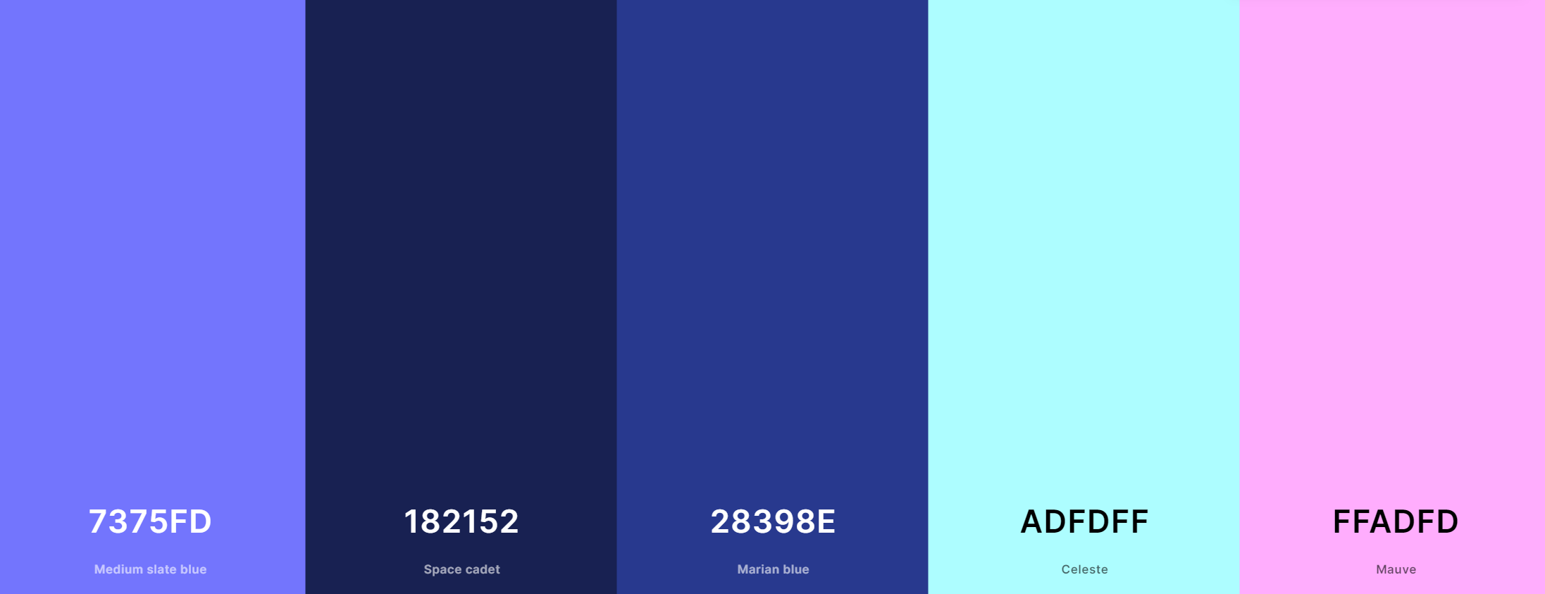
In crafting a visual language for the site, I curated a palette of retro hues, each meticulously chosen to achieve a harmonious visual flow.

Retro Color Palette
I then started to consider typography and opted for a pixel font, to maintain the desired retro ambiance.

Options For a Pixel Font
As part of the ideation phase, I also categorized my works into distinct file types - images, texts, and audio. This allowed me to showcase my diverse range of skills while making it easier for visitors to navigate and explore specific content. With these elements in mind, I sketched out a vision for the overall website layout.
3Design & Build
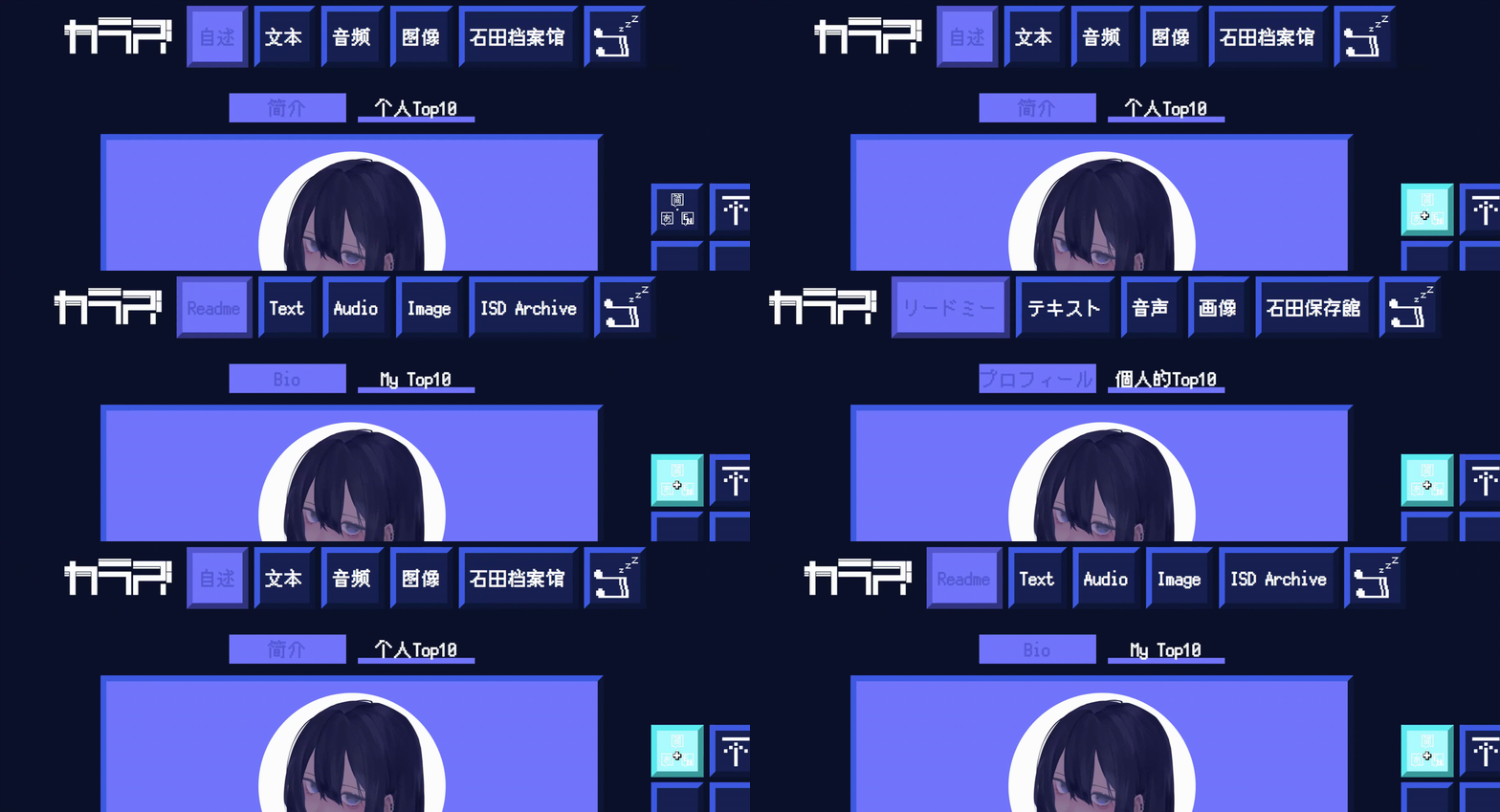
Recognizing the diverse target audience, I designed a multi-language switcher for the website, with English as the primary language to ensure comprehension even if users do not change the language settings.

The Multi-Language Switcher
To create an engaging and immersive experience, I personally crafted pixel art backgrounds for the website. I also designed all the icons used on the site to preserve the retro feel consistently.

Pixel Art Style Background Image
Pixel Art Style Icons
In designing the website's structure, I paid particular attention to content organization. The navigation bar and tabs were designed for optimal user-friendliness, ensuring easy navigation and accessibility. I harnessed the capabilities of JavaScript to augment interactivity.
In terms of content management, separate HTML files were created for each category. Given the extensive content under each category, it was impractical to create a distinct HTML file for each piece. Therefore, I devised a system of subtitles to group similar content together, employing JavaScript to render other categories invisible when one is selected.

Chat Icon
To encourage user interaction and facilitate communication, I integrated a chat function into the website. An original character was designed to serve as the chat icon, and a third-party service was utilized to allow users to send messages directly from the website.
4Post-Launch Usability Testing
Problem Definition
The first step involved identifying potential issues that could obstruct a smooth user experience. I focused on various aspects including the website's navigation, accessibility, aesthetics, functionality, interactivity, content organization, and performance.The objective was to highlight any potential difficulties that users might encounter while navigating and interacting with the site.
User Interviews
I conducted interviews via Zoom with 5 participants from my target population while they were accessing the website using different platforms. I designed specific tasks to evaluate each aspect of the website, including locating specific content, changing the website's language, and sending messages. These tasks were designed to simulate real-world usage scenarios, allowing us to gauge how well the website's design and features cater to users' needs. I also designed questions asking about their expectations, preferences regarding retro-inspired designs, and their potential difficulties when interacting with the site.
Analysis
The final stage involved a comprehensive analysis of the results obtained from the interview and tasks. All participants were able to successfully accomplish the assigned tasks, reporting a seamless and intuitive user experience. This positive feedback underscores the effectiveness of the website's design and functionality in catering to users' needs.
5Outcomes
Direct Messages
Commissions
within the first 2 months