1Overview
This project focused on enhancing two WordPress websites dedicated to environmental advocacy. I improved content readability and website design by reorganizing dense essays with interactive elements, streamlining cluttered news pages, and modernizing the overall aesthetic.
Target Population
The websites managed by my client cater to those intrested in environmental advocacy, with a focus on promoting sustainable practices and reducing waste. This audience seeks to engage with content that not only educates but also empowers them towards making positive environmental changes.
Timeframe
2 month
Takeaways
Working on this project taught me a lot about how crucial it is to have content that's easy to understand and grabs people's attention. It also showed me how good design can make a website much easier to use. I learned that it's really important to know what the audience likes and needs if you want to build a website that not only shares information but also encourages people to take action for a good cause.
2Challenges
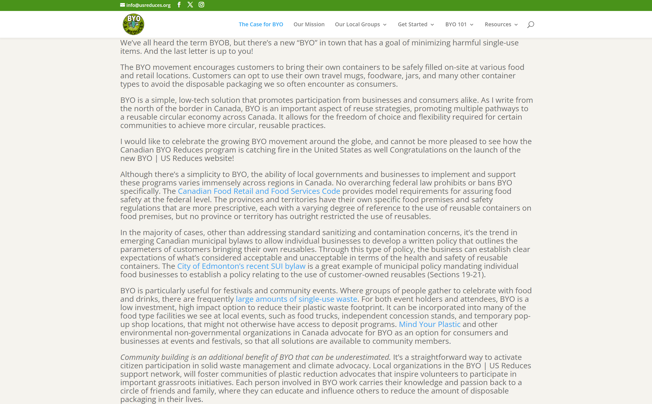
The initial challenge was providing the technical expertise needed to update and maintain a WordPress website built by the client themself, ensuring it met modern design standards and user expectations. The original website struggled to engage users, with the essay page overwhelmed by lengthy text and lacking clear focus points to engage the audience.
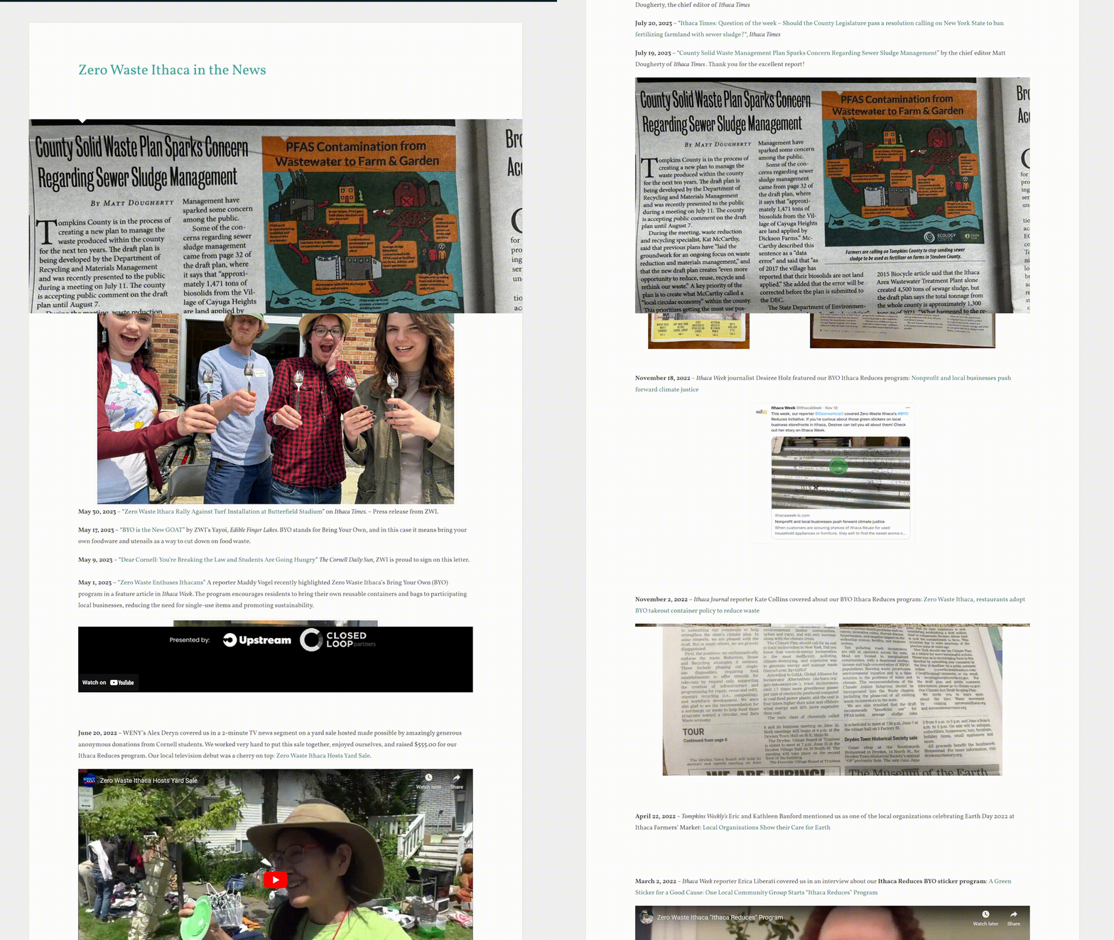
Similarly, the news page, which aggregates all mentions of this organization, was disorganized, causing key information to be buried under an overwhelming mix of text and images. This clutter made it difficult for users to find and understand important content.
3Solutions
Essay Page Redesign
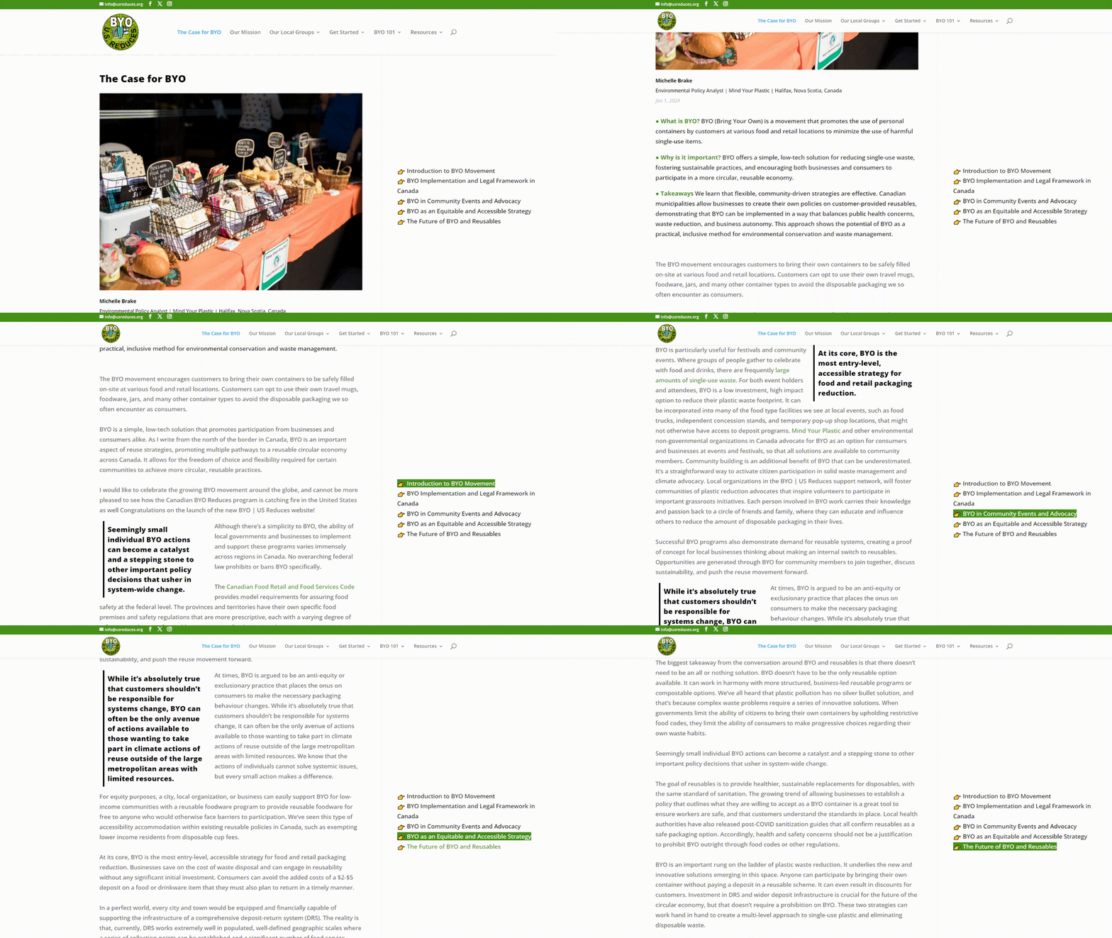
To address engagement issues, the essay page was redesigned with user interaction in mind. Features like pull-quotes to emphasize key points, a floating table of contents for ease of navigation, and a preliminary Q&A segment to introduce the topic gently were introduced. A compelling image at the top of the page was also added to capture attention instantly.

The Original Essay Page

The Retouched Essay Page
News Page Redesign
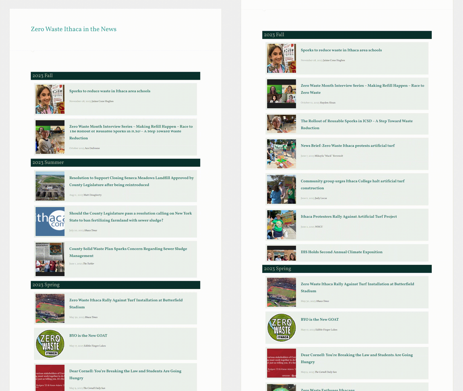
The overhaul of the news page focused on organization and visual appeal. By sorting news items into seasonal categories and featuring select images for each piece, the page became more inviting and easier to navigate. Clear delineation of news titles, authors, and dates, coupled with consistent use of thematic colors, ensured a cohesive look that aligned with the website's overall aesthetic.

The Original News Page

The Retouched News Page
Feel free to explore the essay page and news page on your own!
4Outcomes
More Views
after the update